
As 2019 turned into 2020, headlines warned of an alarming acceleration in Greenland’s ice loss. The Guardian announced:
Greenland’s ice sheet melting seven times faster than in 1990s. . . . Scale and speed of loss much higher than predicted, threatening inundation for hundreds of millions of people.
The Washington Post followed with:
Greenland ice sheet on course to lose ice at fastest rate in 12,000 years, study finds. . . . By 2100, the ice sheet will shrink to the size it was during the last time the world was hotter than today.
Even NASA and JPL joined in with a press release declaring that Greenland and Antarctica were “melting six times faster than in the 1990s.”
I eventually decided to take a closer look, seeking to answer questions like What were past variations like? By how much greater than the past record is the most recent one? Is the record a one-off or part of a trend? Fortunately, the relevant data were available on a website maintained by the Danish government.
After a bit of analysis, I was so surprised by what I found that I penned a Wall Street Journal op-ed in February 2022. Unusual for mass media, I also included the following graph of the data, which shows the amount of ice that Greenland has lost every year since 1900, averaged over ten-year intervals:
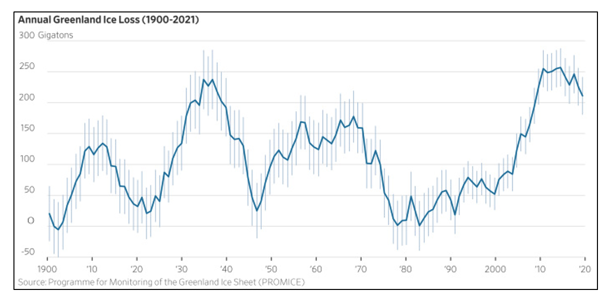
The point of my piece wasn’t to deny that the ice sheet had been losing mass since 1900. It was that headlines describing a dramatic, unprecedented acceleration since 1990 were misleading. In fact, the graph belies the simplistic notion that humans are melting Greenland.
Since human warming influences on the climate have grown steadily—they are now ten times what they were in 1900— you might naively expect Greenland’s losses to march upward in lockstep. Instead, there are large swings in the average annual ice loss and it is no larger today than it was in the 1930s, when human influences were much smaller. Moreover, the annual loss of ice had been decreasing in the past decade even as the globe continued to warm.
My statement Greenland’s ice sheet isn’t shrinking any more rapidly today than it was 80 years ago earned a “mostly false” rating from PolitiFact. I took the accusation seriously enough to write a detailed rebuttal on Medium. More significant was a response from scientists accusing me of “cherry picking” by focusing on the then most recent trend. A very strange accusation, given that my piece showed—and discussed—a 120‑year record precisely to provide context for the cherry‑picked media claims about the prior two decades.
After more than four years, it’s worth revisiting the issue, particularly at the beginning of September, when the rapid summer melt of the surface changes to the slower accumulation of snow. The graph below[1] now includes the most recent five years of data, clearly showing that the decline in mass loss that began before 2020 has now firmly set in, even as the globe has warmed further.
None of this should be surprising. The variability reflects real physics, not noise. A substantial body of research has linked Greenland’s mass loss fluctuations to the North Atlantic Oscillation (NAO), a pattern of air pressure and related atmospheric circulation that changes over decades. For example, a 2025 analysis found that Greenland’s mass variability was 75 percent correlated with the NAO.
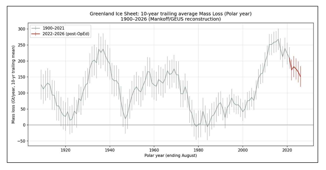
It’s too easy to portray natural variability as an accelerating anthropogenic signal. If you choose a time window that starts near a trough and ends near a peak, the resulting “acceleration” can look alarming. The ongoing effort to promote a sense of climate catastrophe often exploits such selective framing to obscure natural variability and imply an ever-worsening trend.
The full record tells a more interesting story than Human activities are melting Greenland. The ice sheet has been shrinking for more than a century at a rate that rises and falls with natural weather cycles and the average annual mass loss has slowed in recent years, not accelerated. It is an ongoing challenge for climate science to isolate the signature of human influences from these natural fluctuations.
[1] My original analysis, like most academic treatments, used calendar years (January–December). But the official Greenland mass-balance record prefers to close its annual books at the end of the melt season, so its “polar year” runs from September 1 through August 31. For a long-term trend this distinction is immaterial—you’re just shifting the accounting window by four months, but it does mean the two versions of the graph, while very similar, don’t line up exactly.
Steven E. Koonin is the Edward Teller Senior Fellow at the Hoover Institution, where he contributes to the Tennenbaum Program for Fact-Based Policy and the George P. Shultz Energy Policy Working Group. He is the author of Unsettled: What Climate Science Tells Us, What It Doesn’t, and Why It Matters (BenBella Books, 2024).
 Powered by